Design kits
Rapidly build beautiful and accessible experiences. The Carbon kit for Adobe XD contains all resources you need to get started.
Get the libraries
Install Adobe XD
To design with Carbon you must have the most recent version of Adobe XD installed.
Get the Adobe XD Creative Cloud libraries
- Open the Creative Cloud Library App.
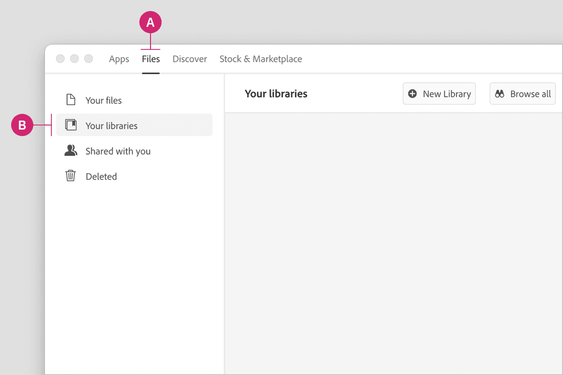
- Navigate to the Files tab in the header (A). Select the Your libraries page in the left hand navigation (B).
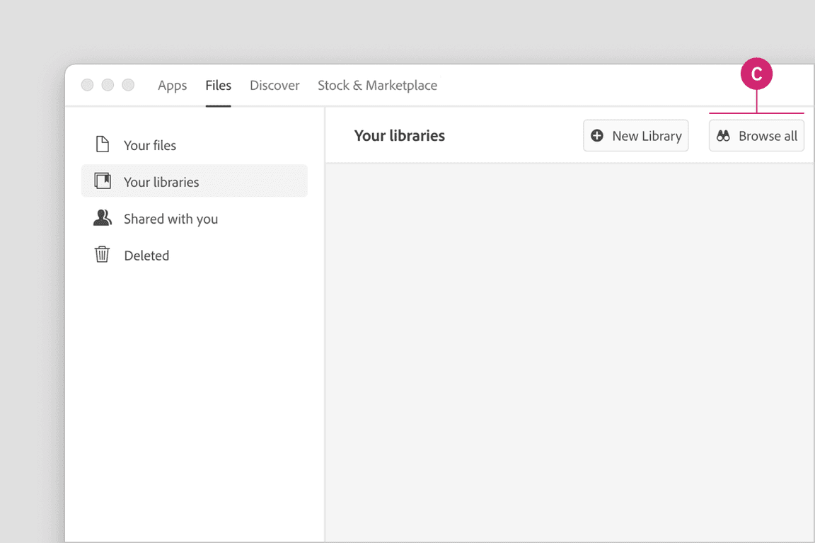
- Select the Browse all button to browse all libraries (C).
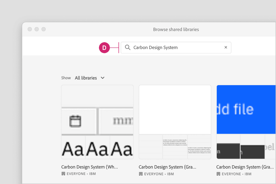
- In the search bar, search for “Carbon Design System” (D).
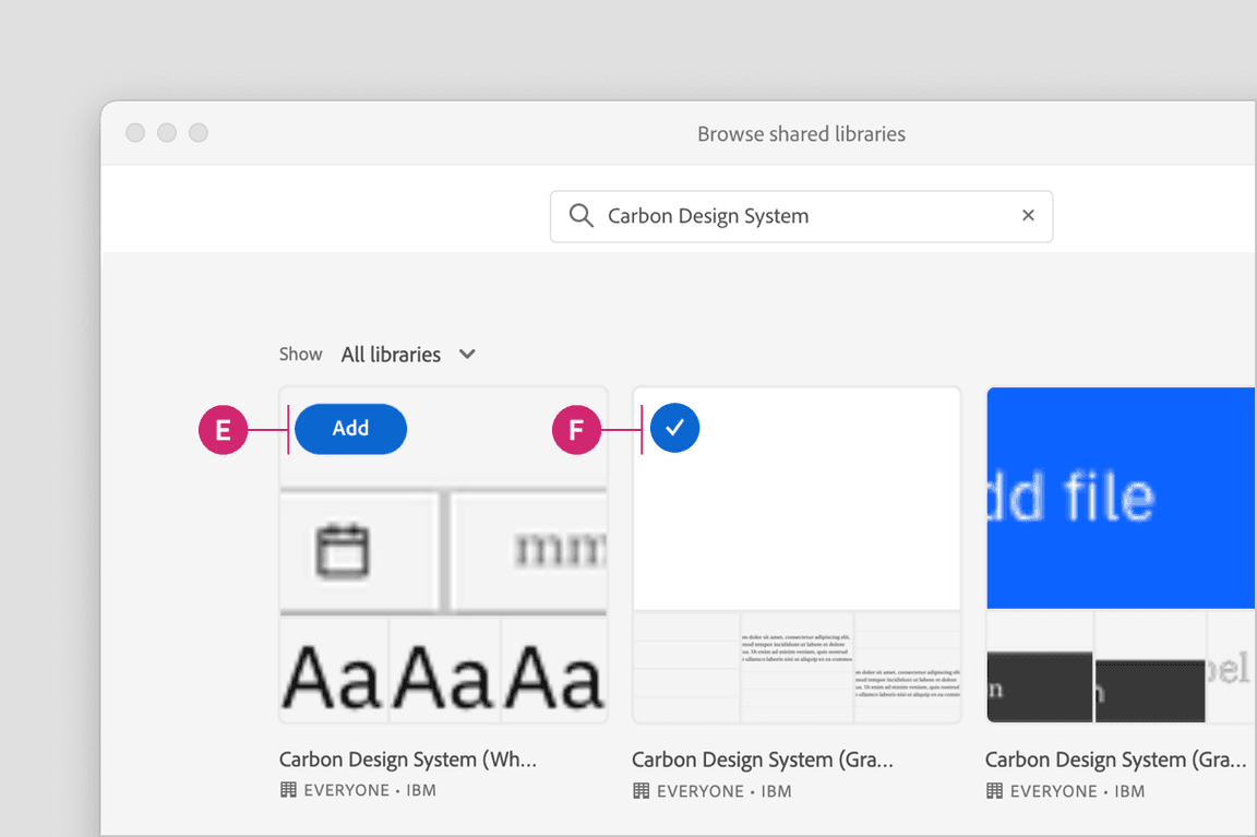
- You will see the four Carbon theme libraries that are available to Add (E) by hovering over the library previews. Once you add a library, the library will be marked with a checkmark (F).
To view the four Carbon theme libraries on the web, visit these links.
Start designing
Components
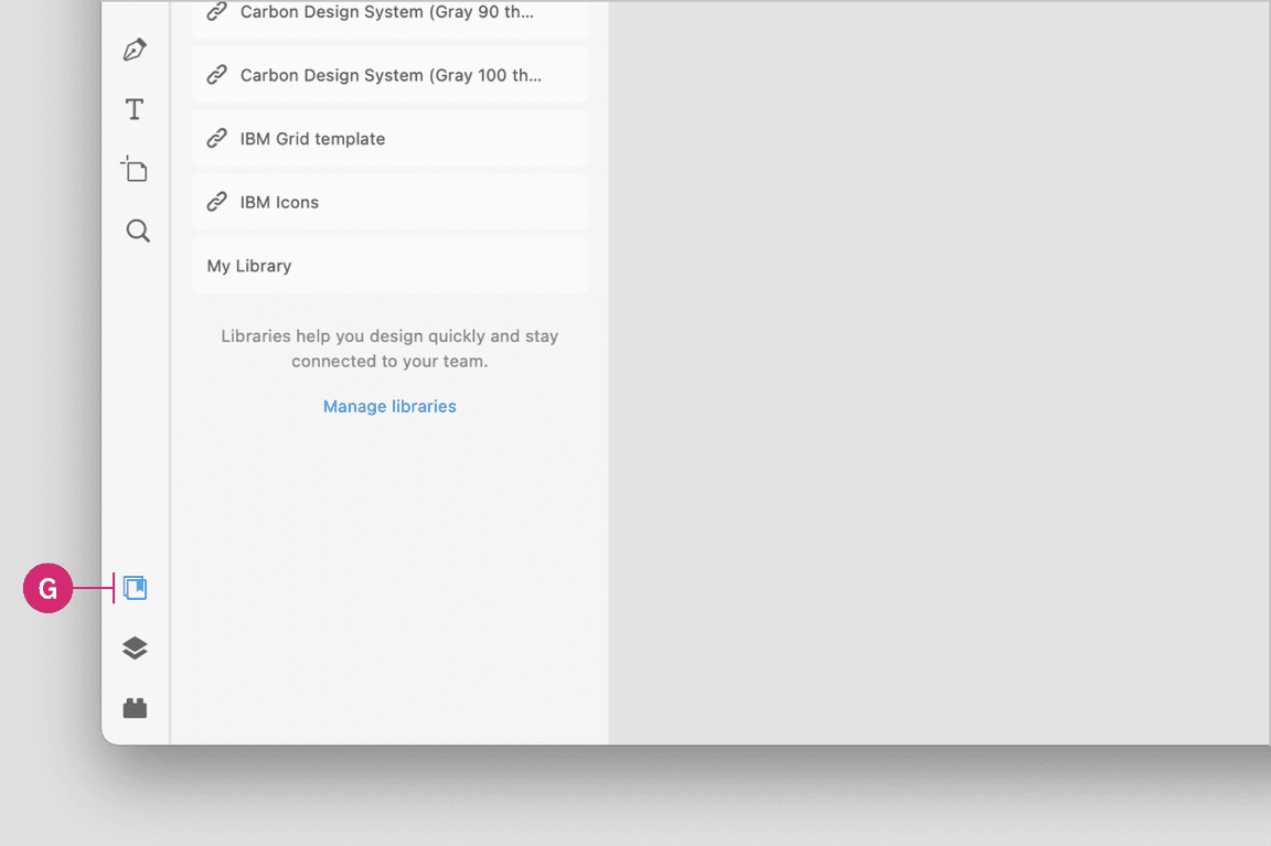
Included in the library are all 32 of the Carbon components and their variants. To insert a component, select the Document assets icon in the left side rail (G).
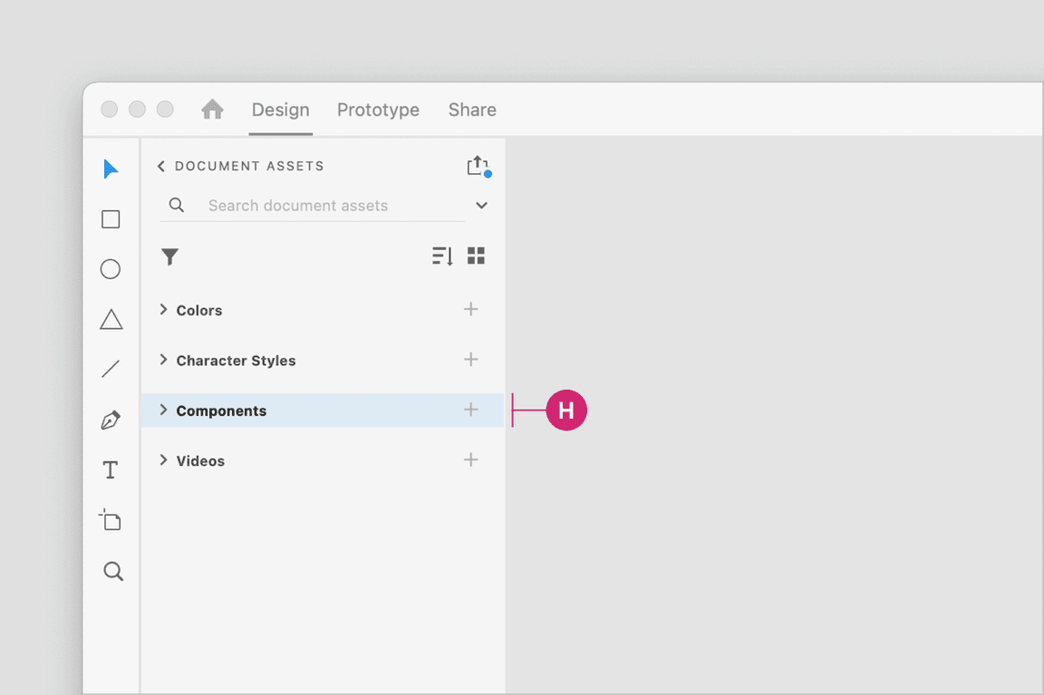
Find the component you would like to use under the Components section (H) in the document assets panel. Drag the component from the panel onto the canvas.
View the name of the component in the right sidebar. If the component has variants, you’ll see the variants under the Component (instance) section to configure the properties and values of that component set.
For more help on how to use Adobe XD components, see the Adobe XD docs.
Grids
Grid templates are included in each Carbon themed library. These grid templates are on a canvas that can be configured at the five 2x grid breakpoints and also includes the 16 column grid.
Colors
The Carbon color tokens are added as colors in the component assets panel in Adobe XD. To apply a color, select an object then in the Colors section of the component asset menu you can select a color from the Carbon theme library. In addition to applying colors to objects, you can also apply colors to text layers.
To learn more about applying colors in Adobe XD, see the Adobe XD docs.
Character styles
To apply a character style, select a text layer. Then in the component assets panel, select the character style from the Carbon theme library. Use color to change the color of a character style.
To learn more about applying character styles in Adobe XD, see the Adobe XD docs.
Icons
The IBM Icon library is seperate from our theme libraries. Add the library by using the Creative Cloud app or by visiting this web link.
Support
If you’re brand new to Adobe XD, they offer some great tutorials.
Releases
Enhancements to the kit will be rolling out in the future. When a new version of the library is available, you will need to download the new file to replace the old one. Releases will be posted to the GitHub repo.
Feedback
Help us improve this component by providing feedback, asking questions, and leaving any other comments on GitHub.
